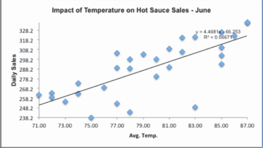




What’s A Scatter Plot?
A Scatter Plot is a chart that shows the relationship between two variables (if any).
A Scatter Plot is also known as an XY Plot since the variables are plotted on the X and Y axis. The strength of correlation on a Scatter Plot can be measured using a Correlation Coefficient.
Learn more about Scatter Plots in Green Belt Training.
How To Create A Scatter Plot In SigmaXL
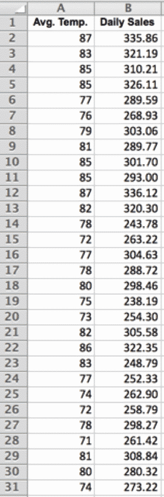
Download the beta-wp.goleansixsigma.com Scatter Plot Data Set for SigmaXL here.
1. Select the “Scatter Plot” tab
2. Select the raw data:
3. SigmaXL > Graphical Tools > Scatter Plots:
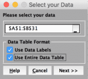
4. Click “Next”:
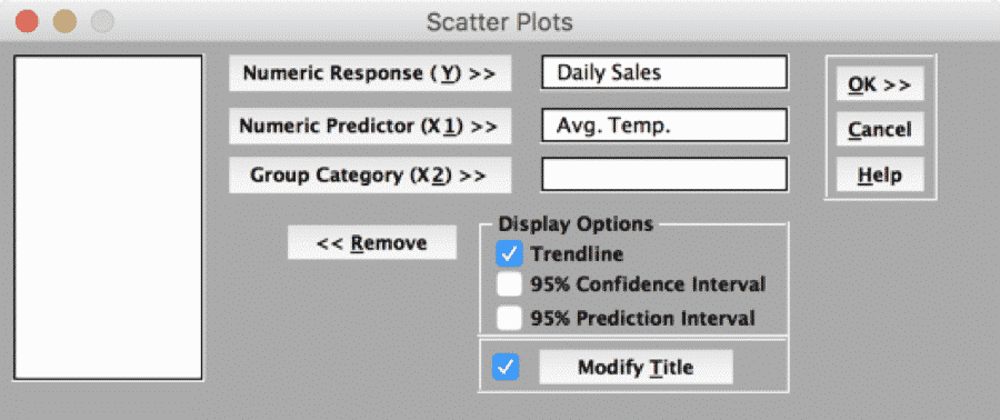
5. Click “OK”: